Project Summary
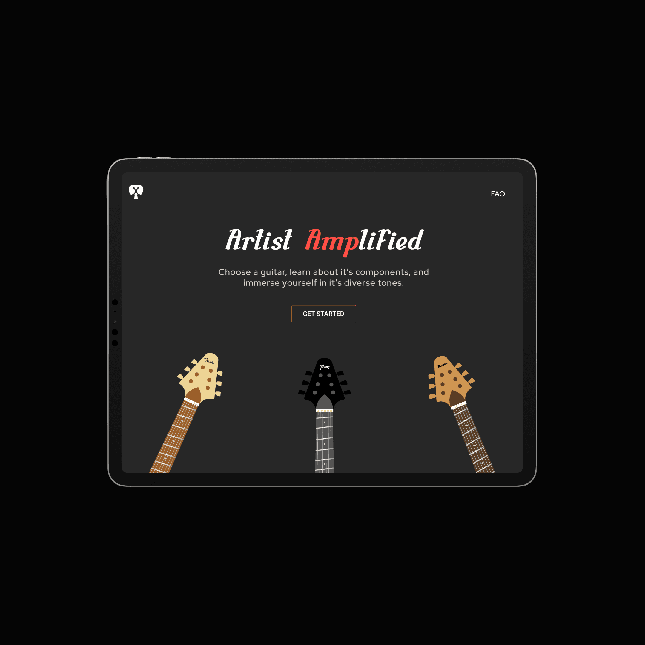
Despite the widespread interest in playing the guitar, many enthusiasts lack an understanding of its structure and how it operates. My objective was to develop an informative platform that caters to the user and enables guitar enthusiasts to achieve expertise in comprehending both the anatomy and functionality of the instrument. A few things to keep in mind:
While information on individual guitar components can be found scattered across various sources, there’s a lack of comprehensive platforms that consolidate this knowledge into an interactive and engaging experience.
While custom guitar building platforms exist, none specifically offer an exploration of amp controls and sound testing, leaving a void in understanding how different settings influence tone production.
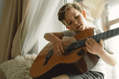
This app is thoughtfully designed for aspiring guitarists who are either new to playing or in the early stages of their musical journey. It aims to foster a love for music and enhance guitar skills, catering to both individual learners and classroom environments.
Target audience would be aspiring guitarists in the early stages of learning. Suitable for individual users as well as classroom settings, homes, schools, and educational centers.
The primary display for the app will be tablets and iPads, specifically the Pro 11. This ensures a high-quality visual experience that supports various learning styles.
Audience Persona

UX Trends
Spotify Pets: This playful website design features captivating illustrations that immediately draw users in through its vibrant and colorful UI.
The UI incorporates colorful and engaging illustrations, using playful imagery to capture attention.
I incorporate colorful guitar illustrations throughout the user journey, with detailed depictions of each guitar part, aligning with this engaging and playful design trend.
Concept Sketches
Inspiration
This inspiration board draws upon the vibrant and dynamic aesthetic of modern rock and punk culture. Bold graphic elements, such as graffiti-inspired artwork and urban street scenes, evoke a sense of energy and rebellion. Vibrant color palettes, featuring bold hues of red, black, and electric blue, infuse the design with intensity and attitude.
Key words:
Edgy
Vibrant
Bold
Wireframes
Iterations
I completed four phases of iteration before reaching the final product, beginning with basic layouts to establish clarity. Each phase allowed me to refine the interactive elements, functionality, and visual design, enhancing the overall user experience. Here’s a glimpse into some of my iterations along the way:
Visual Assets
Final Designs
Takeaways
This project was my first experience managing my own timeline, and it taught me many valuable lessons throughout the design process:
Creating a stand out user experience means considering needs holistically, from design and visuals to navigation and features.
By addressing each aspect comprehensively, it’s important to ensure that users not only enjoy the aesthetics but also find the interface easy to navigate and interact with, ultimately leading to a more satisfying and fulfilling experience.


