Project Summary
Rochester's current website is outdated, with overwhelming text and too many links, leading to poor user experience. I was tasked with redesigning a section focused on helping residents easily find information about the city's recreational programs. Key goals include:
Provide clear navigation and make information readily accessible
Prioritize readability and ensure a visual cohesion
Provide effective call to actions and visual cues
Integrate interactive elements (search bar, city maps, etc.)
Defining Problems
The Rochester website faces several key issues that negatively impact user experience. These issues, when combined, create a disorganized and frustrating experience for users, ultimately diminishing engagement with the website.
Inconsistent color schemes and type hierarchy confuse users, leading to misinterpretation of content.
Unclear call-to-actions reduce engagement, as users struggle to identify the purpose of buttons or links.
Hidden links blend into regular text, making navigation difficult.
Poor use of white space, especially on the homepage, creates emptiness and weakens the overall design cohesion.
Comparative Analysis
I mainly drew inspiration from both the State of Mississippi and City of Silverthorne websites, particularly in their effective use of UI elements and visual design.
Mississippi's site enhances user accessibility with a prominent search bar and chat box. Its blue tones and vibrant accents create a cohesive, appealing color palette, while the background imagery sets a professional yet welcoming tone. This inspired my approach to making key interactive elements on Rochester's site—like the search function and call-to-action buttons—both prominent and user-friendly, with a consistent color scheme to prevent confusion.
The City of Silverthorne's website uses vibrant photography and colors to showcase its attractions, with effective buttons, calendars, and blog posts to keep users informed. Inspired by this, I integrated local imagery and key Rochester attractions into the redesign, while refining interactive elements to make buttons and event sections visually appealing and easy to access.
User Interviews
Sketches & Wireframes
Visual Directions
Iterating
Designing two contrasting website iterations was challenging but ultimately enhanced my approach to balancing design principles. Here’s a breakdown:
Urban Elegance focused on minimalist design with clean structure and muted red tones for a sleek, modern feel throughout the interface.
The Vibrant Utopia approach uses a clean, grid-based layout with soft greens and neutrals, creating a calm, professional, and highly accessible user interface.
Result: Iterating on both styles helped me experiment with balance and contrast, leading to a more cohesive user experience across the designs.
Final Designs
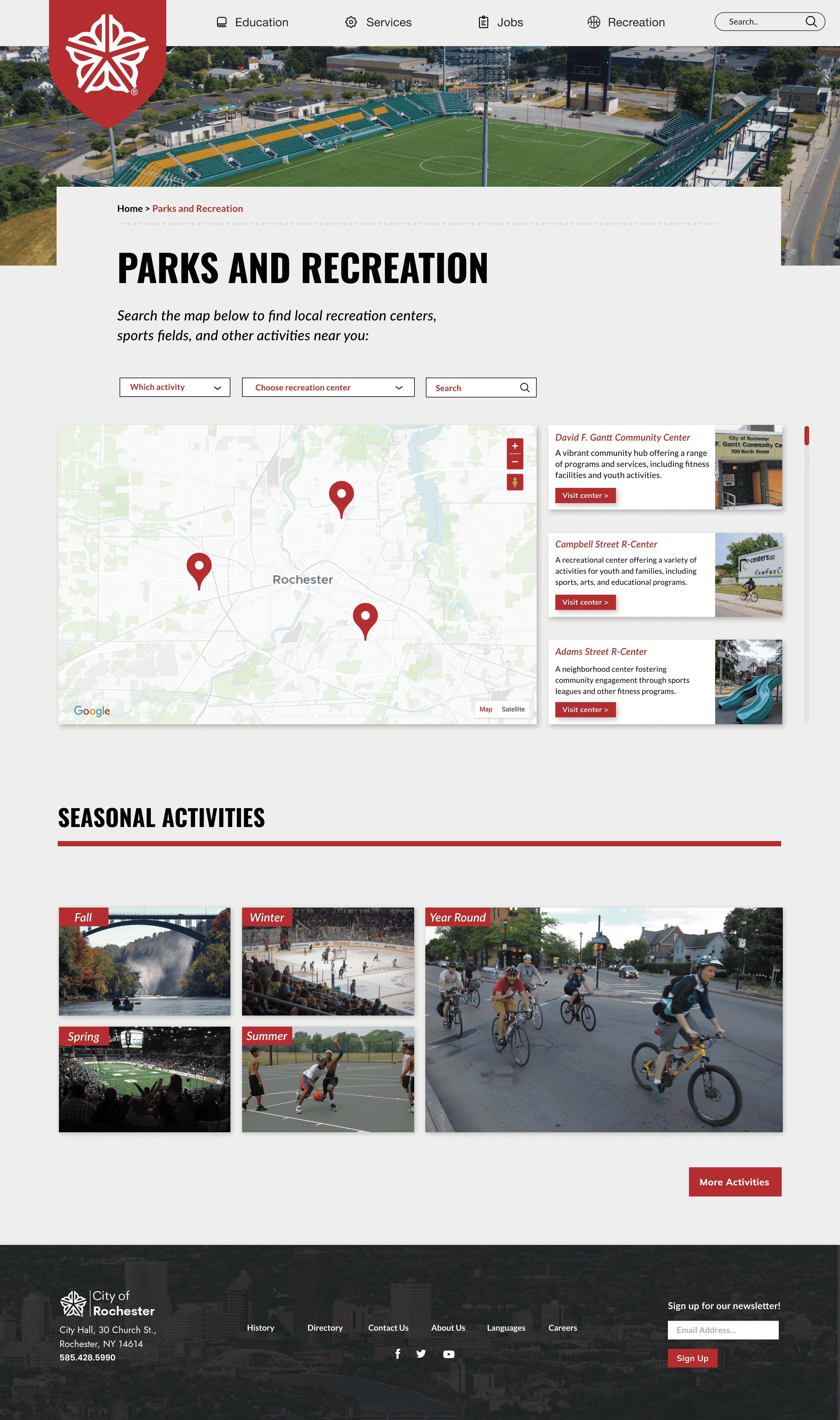
In the final design, I embraced a modern urban aesthetic that enhances user engagement through thoughtful visual choices. Key elements include:
Bold Color Scheme: The prominent red hue serves as a visual anchor, infusing energy and confidence into the layout.
Sleek Iconography: Polished icons draw users in and create an inviting experience.
Minimalist Design: Clean elements and sharp, geometric lines convey modern sophistication, reflecting urban life.
Dynamic Imagery: Engaging visuals resonate with younger adults, providing a fresh, relatable experience that aligns with their interests in urban living.

Takeaways
With the completion of the Rochester website redesign, I am confident that I met the initial objectives set during the research phase:
Modern Design: The sleek and contemporary aesthetic introduces a bold color scheme that revitalizes the city's traditional visuals, creating a more inviting and engaging online presence for users.
Cultural Revitalization: The redesign successfully breathes new life into Rochester’s cultural identity by integrating visuals and design elements that resonate with the community, fostering a stronger connection between the city and its residents.
Intuitive Navigation: I prioritized a consistent and user-friendly experience across all pages. The streamlined navigation allows users to easily access information, enhancing overall usability and ensuring that visitors can quickly find what they need.


